4 Brands That Aced the Email Marketing Challenge


How do interactive and creative emails you create compare to your competitors?
As a business owner, you need to view your email campaigns from the perspective of your customers. Daily, customers receive several newsletters from various brands around the world. Many of these newsletters contain the same old, automated content that does not make any difference, failing to grab the attention of their target audience.
However, there are a few brands that have gone to the next level by improvising with an out-of-the-box mindset and enriching their emails with different content and media usage. Following are some of the brands that aced the email marketing challenge.
1. Aesop
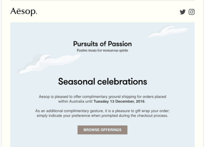
Aesop has perfected the art of newsletters. They are made of all the necessary ingredients; unique colours, dazzling illustrations, and most importantly: rich content that appears original and convincing. A brief glance at their newsletter and you know what you need to hear, where to go, and what to see – it’s hypnotic how well they communicate their message with concise and compelling descriptions. In case you are interested in getting “more”, they always add a button to proceed further.
2. BuzzFeed
BuzzFeed is in the media business, so expect them to run one of the best email campaigns on the Web. In fact, their newsletter is counted among their top traffic sources. They are experts in incorporating subject lines and preview with engaging copy that forces a “click”. For example, one of their popular newsletters is “This Week in Cats”. This newsletter groups together cute cat stories and heavily relies on cat pictures to attract the attention of readers. What they have done is quite simple: they have promoted their brands with help from one of the most loved pets on the Web.
3. Uber
It is apparent that Uber has researched its target audience well. It is well aware of how busy their audience is, and thus, they have gone for minimalistic emails. They are straight to the point in their emails with a brief but straightforward CTA. Hence, it is ideal for their subscribers that are short on time and can read it instantly. Customers who are interested in more details can hit a button to get more information on the subject. Moreover, Uber is quick to distribute promotions along with an intuitive map for your rides, showing all your journeys.
4. Litmus
The digital marketing team at Litmus seems to have aimed at a young target audience. This is because they have included GIFs and animation content in their emails. These additions certainly ramp up the visual appeal of their emails and motivate the readers to read content without being bored. By using compelling headlines, they make sure that the reader can grasp a basic idea of their emails.


